Places: London Bridge Station

i LOVE CITIES AND I LOVE EXPLORING THE PLACES WITHIN THE CITIES. AS PART OF THE PLACEs series of blogs, i look at new developments across london and give my take on what works and what doesn't in the capitals new places.

There is something unashamedly British about the excitement created by a freshly renovated train station. Following facelifts of both King’s Cross and St Pancras, London Bridge is the capital’s latest terminus to get the makeover treatment — to the tune of a cool £1 billion. Five years in the making, the redeveloped station is finally due for completion this summer.

The new undulating canopies seen from The Shard in winter.

The new undulating canopies seen from The Shard in winter.

The UK’s fourth-busiest station, London Bridge welcomes 54 million passengers annually. Thameslink’s announcement that they planned to increase this number by introducing a metro-style service — with up to 24 services per hour —on their cross-London routes from December 2019 meant that serious redevelopment was needed. And all while the station remained operational.

This increase in capacity would have been difficult for any station, but London Bridge came with a unique set of issues. Having opened in 1839, London Bridge is one of the world’s oldest stations and its Victorian infrastructure was notoriously hard to navigate, with its warren-like maze of tunnels and escalators a constant confusion for modern commuters.

The redevelopment has seen the creation of four new platforms and a reflexive, rippling roof that undulates above the waiting passengers. The new roof is the station’s most eye-catching new addition and yet it is most impressive from above, which means that it’s largely wasted on those millions of passengers who may never see its full impact.

Beneath the platforms, an expansive passenger concourse has been hollowed out of vaults once home to grungy nightclubs, lock-up garages, and the old London Dungeon. While offering a much needed north-south connection, the concourse also provides a single access point to all the station’s platforms for the first time in its history.

To the south, the new St Thomas Street facade provides a clean re-imagining of the original Victorian brickwork detailing to create an active frontage to the station’s once forgotten southern side. The sweep of arches is already being populated by cafes and restaurants, linking the station to the nearby lively Bermondsey Street.

The brand new retail arcade linking London Bridge train station with the Underground station.

The brand new retail arcade linking London Bridge train station with the Underground station.

At its northern side, the concourse’s modern new entrance opens out onto Tooley Street and the More London development beyond. While the old South Eastern Railway building has been demolished to make way for an underwhelming public space, the Shipwright’s Arms, a local landmark, has survived the cull of regeneration.

The redevelopment’s hidden gem sits at the heart of the project: a vaulted retail arcade linking the new concourse with the underground station. The captivating arcade represents station owner National Rail’s most ambitious retail strategy to date, with the introduction of almost 9,000 sq. m of retail floorspace significantly boosting National Rail’s revenue stream.

London Bridge station is undoubtedly a feat of engineering. It may not meet everyone’s aesthetic, but it’s hard to deny that the new station is a success. It set out to create an accessible, legible new station brings together disconnected neighbourhoods and celebrates its Victorian legacy. It has managed that on all counts. Now if only they could get the trains to run on time...

Mind the Creativity Gap: Yolt

EACH WEEK, I MAKE THE MOST OF MY DAILY COMMUTE AND GIVE MY TAKE ON SOME OF THE ADVERTISING ON LONDON UNDERGROUND. SOME OF IT'S DECENT, SOME OF IT'S CRAP. THIS WEEK... YOLT.

The original Yolt tube ad. 

The original Yolt tube ad. 

This week on MTCG we are taking yet another look at our old friend, Yolt. This year has seen money management app Yolt spread its brand all over the London Underground with its marketing campaign that MTCG has looked at not once, but twice: here and here. It should be noted that despite this being the third Yolt post in two months, Yolt is still a relatively unknown brand that's still building up its tone of voice. 

The original ad follows the same vague script as the previous two Yolt ads we've looked at, using a tone of voice that I still think is a little too informal for a financial app regardless of how fresh and jaunty said app is. Even though it has gone for the conversational route, I'm still not convinced that the English reads comfortably and I think it could use a little tidying up in line with the other makeovers I've done recently. 

For the re-worked ad, I've kept the structure that I've used in those previous Yolt tube ad makeovers to ensure a strong theme across the campaign. I've kept a similar theme as the original ad, switching black cab for Uber to keep the alliteration throughout. Of the three Yolt ads that I've re-worked, this one is the most similar to the original. However, this makeover has meant that this ad is now in line with the other Yolt ads, which strengthens the campaign. 


My re-worked Yolt tube ad.

My re-worked Yolt tube ad.

Mind the Creativity Gap: TM Lewin

EACH WEEK, I MAKE THE MOST OF MY DAILY COMMUTE AND GIVE MY TAKE ON SOME OF THE ADVERTISING ON LONDON UNDERGROUND. SOME OF IT'S DECENT, SOME OF IT'S CRAP. THIS WEEK... TM LEWIN.

The original TM Lewin tube ad

The original TM Lewin tube ad

This week, MTCG is taking a look at one of those classic London brands, TM Lewin. TM Lewin is something of a London institution, being founded way back in 1898 in the tailoring centre of Jermyn Street. These days, TM Lewin has spread across the capital and, indeed, the world, and is one of the most recognisable high street suit suppliers in the city.

The original ad showcases the more modern TM Lewin: all casual blazers, mismatched trousers, and colourful socks. I like the original tagline "Lose the suit" because it is short, sharp, and to the point. It stands out because it goes against everything that the audience would know about TM Lewin as a brand, and it works well with the look that the ad is pushing.

My re-worked tube ad keeps the same simple style, using just three words: "Whatever suits you". This plays as the customer using TM Lewin's range to find their own unique style, highlighting the versatility of the brand and the options that it has for whatever your style is. While I do like the original copy, I feel this offers a stronger message to the consumer that TM Lewin is a brand for everyone. 

My re-worked TM Lewin tube ad.

My re-worked TM Lewin tube ad.

Get Lost: Barcelona

I love traveling - and probably travel more than anyone I know - so it makes sense that I write about it. Get Lost is a series of short, snappy travel guides (250 words or under) where I write about the places I visit.

barcelona-3226639_1920.jpg

A RELENTLESS RIOT OF LIFE ON THE COBALT SHORES OF THE MEDITERRANEAN, BARCELONA BLENDS SHOW-STOPPING ARCHITECTURE WITH SUN-DRENCHED BEACHES AND A VIBRANT PLAÇa CULTURE TO CREATE EUROPE'S MOST ENTHRALLING ESCAPE.

Barcelona’s diverse history comes alive in the Gothic Quarter, where canyons of narrow lanes thread past imposing medieval mansions and Roman ruins hidden away in quiet courtyards. Explore a little further and you’ll hit the calmer El Born neighbourhood, home to a museum celebrating Barcelona’s adopted son, Pablo Picasso, and the city’s largest park, Parc de la Ciutadella. Outside the centre, La Sagrada Família, the unfinished modernist masterpiece by Antoni Gaudí, looms over the skyline in a tangle of giddy spires and towering cranes.

On sunnier days, head down to the Barceloneta beaches thick with bronzed locals working on their sculpted bodies, or take the waterfront cable car up to Montjuïc, the leafy, parkland setting for the 1992 Olympic Games. Venture north and you’ll hit Gràcia, formerly a city in its own right but now a bohemian neighbourhood with lively squares and Parc Güell, Gaudí’s whimsical take on a city garden. Further north are the Bunkers del Carmel, former military bunkers from the Spanish Civil War that offer the best 360ᵒ views of the city.

Despite its attractions, the real delight of Barcelona is its inexhaustible zest for life. The city’s irrepressible Catalan spirit will enamour you, whether you’re clubbing till lunchtime, trawling the tapas bars of Carrer Blai, or enjoying vermouth with friends in a leafy plaça.

Mind the Creativity Gap: Visit Florida

EACH WEEK, I MAKE THE MOST OF MY DAILY COMMUTE AND GIVE MY TAKE ON SOME OF THE ADVERTISING ON LONDON UNDERGROUND. SOME OF IT'S DECENT, SOME OF IT'S CRAP. THIS WEEK... VISIT FLORIDA. 

The original Visit Florida tube ad.

The original Visit Florida tube ad.

After a gratingly long winter here in London, summer has finally arrived and with it some helpfully placed reminders about all things holiday related. This week, MTCG is looking at the aptly named Visit Florida website, and their latest marketing campaign promoting, unsurprisingly, the Sunshine State itself, Florida.

The  original Visit Florida is perhaps one of the least imaginative ads we've ever looked at here at MTCG. A photo of a couple enjoying an infinity pool could be literally anywhere in the world and tells the audience nothing about Florida at all. The generic qualities of the photo are lessened, relatively, by the generic qualities of the tagline, which simply states, "Escape to the Sun". Again, this could refer to literally anywhere in the world and does little for the Florida brand.

In my re-worked tube ad, I've gone with "Find your Florida". Florida is a diverse state and alongside infinity pools visitors can enjoy nature at the Everglades, the theme parks of Orlando, the nightlife of Miami, the Kennedy Space Centre, etc. The tagline "Find your Florida" would go with a range of different images and create a much stronger marketing campaign for the website. 

My re-worked Visit Florida tube ad.

My re-worked Visit Florida tube ad.

Mind the Creativity Gap: Ovo

EACH WEEK, I MAKE THE MOST OF MY DAILY COMMUTE AND GIVE MY TAKE ON SOME OF THE ADVERTISING ON LONDON UNDERGROUND. SOME OF IT'S DECENT, SOME OF IT'S CRAP. THIS WEEK... OVO.

The original Ovo tube ad.

The original Ovo tube ad.

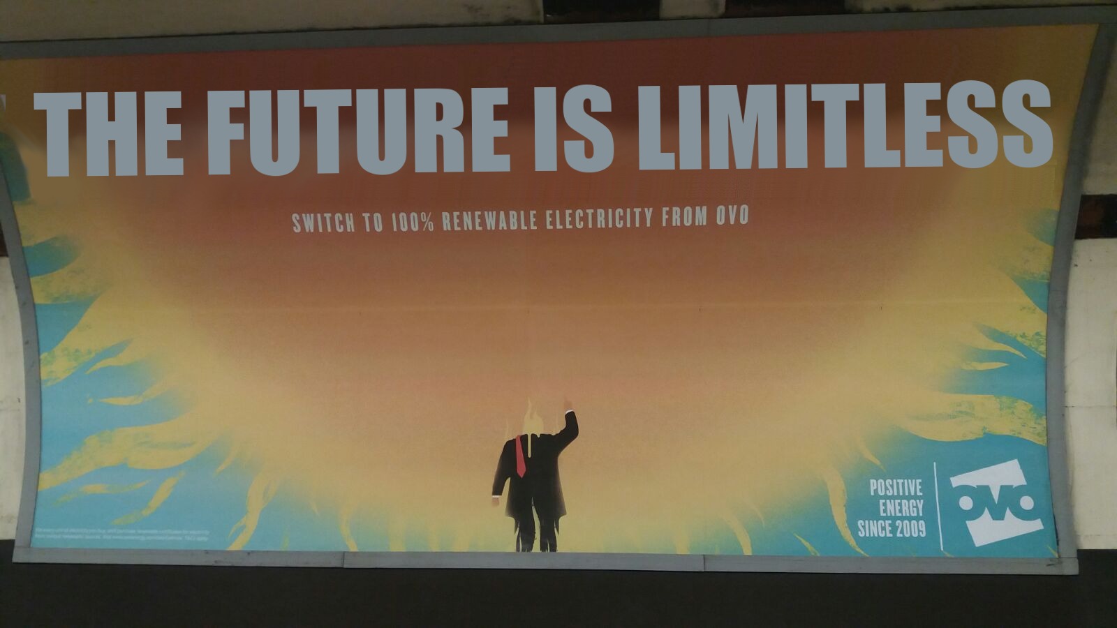
This week on MTCG, we are looking at something that I'm a particular fan of — renewable energy! In particular, we're looking at the new Ovo tube ad which is advertising that they provide 100% renewable energy with a cheeky retort at that famous climate-change denier (depending on his audience, of course), Donald Trump. Ovo isn't a brand that I am overly familiar with but this is a fairly well-established energy company we are looking at here.

I must admit I like this ad. Its a powerful message twinned with a powerful image that achieves exactly what it sets out to do. I'm not sure I would have chosen the Trump route, but it works with the audience. My only gripe with the original ad is the quick repetition of '-able', which is regrettable. But if this ad helps people switch to renewable energy then I'm happy with that.

My re-worked ad looks more at the possibilities of renewable energy, not just renewable energy itself. The potential power of the sun is limitless (until the sun burns out, of course, but no-one will be bothered about charging their iPhones then). I've gone for 'The Future is Limitless' to tell the story of what the future might hold with renewable energy.

My re-worked Ovo tube ad.

My re-worked Ovo tube ad.

Mind the Creativity Gap: Farmdrop

EACH WEEK, I MAKE THE MOST OF MY DAILY COMMUTE AND GIVE MY TAKE ON SOME OF THE ADVERTISING ON LONDON UNDERGROUND. SOME OF IT'S DECENT, SOME OF IT'S CRAP. THIS WEEK... FARMDROP.

The original Farmdrop tube ad. 

The original Farmdrop tube ad. 

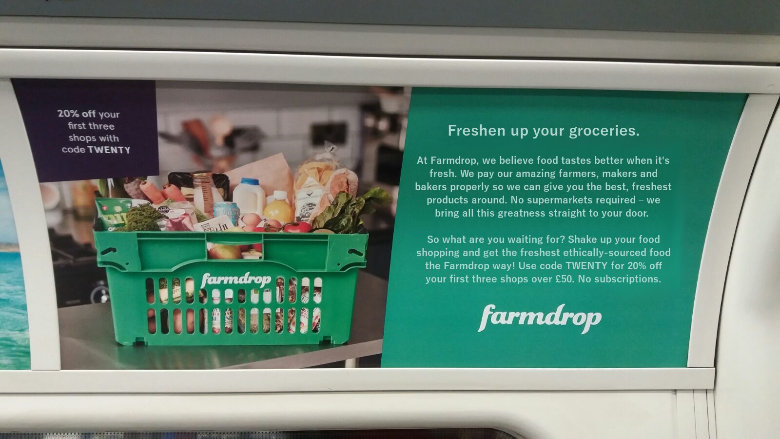
Spring has finally sprung here in London and Farmdrop caught my eye on the tube recently with their ad promising me fresh products straight to my door. Although Farmdrop as a brand is familiar to me, I've never used one of these types of service before. That said, the benefits of getting high quality food delivered straight to your door is hard to ignore. 

The original Farmdrop ad is a bit different to what we're used to here at MTCG. There's a lot more text than we're used to which can be a good thing on tube ads because generally people on tube trains have time to read. However, that doesn't mean its easier to get your message across if there are more words to use. Often, longer ads become rambling and fail to get the message across as succinctly as they might. This offering from Farmdrop isn't far off that.

The copy on the ad is meandering and fails to provide one call to action throughout the ad. Even the heading, which should grab attention, falls flat. Swap up a bit of your grocery shop would struggle to sound less enticing if it tried. The idea of going back to how food used to taste is a long-winded way to get to the food being freshly made and produced. And while I like the detail about butter whacking and wood-fired ovens, it still feels like Farmdrop are simply describing some of their products as opposed to engaging with the audience.

In my reworked ad, I've tried to liven things up while still keep with Farmdrop's original longer copy style. Freshen up your groceries immediately engages better with the audience while having a double mean with freshen up meaning fresh and change. In the rest of the copy, I've focused on fresh food over and over again. Farmdrop should represent fresh products and I feel this reworked text makes that stand out much better. 

My re-worked Farmdrop tube ad.

My re-worked Farmdrop tube ad.

Mind the Creativity Gap: Yolt

EACH WEEK, I MAKE THE MOST OF MY DAILY COMMUTE AND GIVE MY TAKE ON SOME OF THE ADVERTISING ON LONDON UNDERGROUND. SOME OF IT'S DECENT, SOME OF IT'S CRAP. THIS WEEK... YOLT.

The original Yolt tube ad.

The original Yolt tube ad.

Here at MTCG, we like to look at some of those lesser known brands that turn heads with their advertising on the tube. Taking a marketing campaign onto the tube is not cheap, but when it's done well it can have a massive impact on the success of the company. This week, we're taking another look at Yolt, a money management app that I admit to having never heard of until I reworked another of their ads a couple of weeks ago. 

As I noted last time round, I'm not familiar with Yolt's tone of voice but from what I have seen they employ an informal, chatty tone of voice. Considering this is a financial services app, I would argue that they fall close to being overly informal as the original text doesn't really ready very cleanly. The English doesn't flow quite correctly and it seems a little juvenile, although unlike the previous Yolt ad I looked at they have managed to get a rhyme in there. 

In my reworked tube ad, I've kept the same idea as the original ad — the choice between two different qualities of food. I've used the comparison of a gastropub or a greasy spoon for alliteration purposes, and used alliteration again at the end of the copy to tidy it up. I've used a slightly more formal language but still kept it quite chatty, which I think finds the perfect balance for an app like Yolt.

My reworked Yolt tube ad. 

My reworked Yolt tube ad.